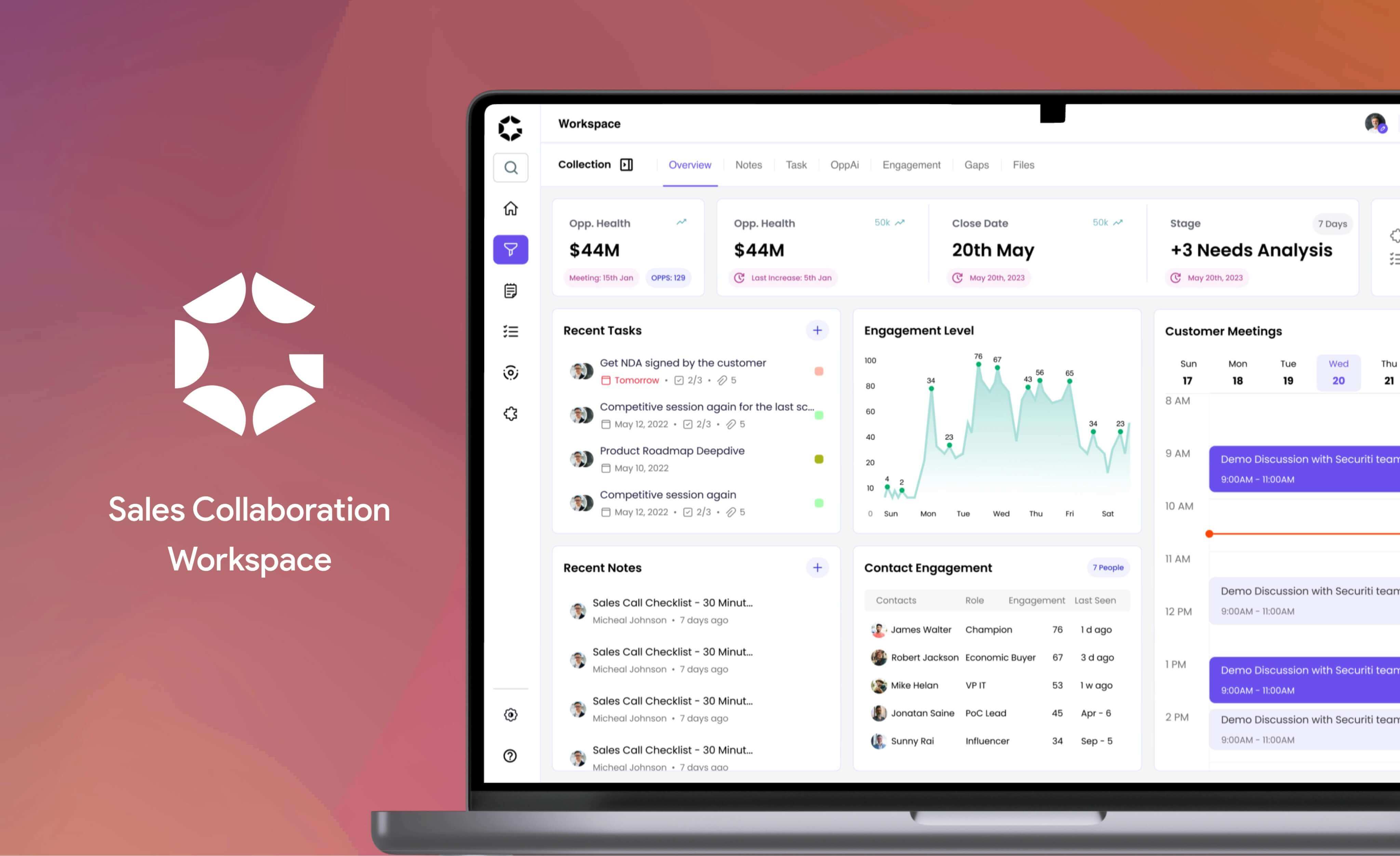
Sales Collaboration WorkSpace
Refining the user experience for Gyaan’s sales collaboration workspace
Gyaan is a sales collaboration workspace, excels in facilitating effective sales management with its unique collaboration system. In 2023, they established their inaugural UX team, recognizing the importance of refining user experience. This strategic move reflects Gyaan's commitment to enhancing the platform and ensuring a more intuitive and efficient sales management process. 🚀✨
My Role
Research, Analysis, Product Design, Interaction Design, Design Systems, User-testing, QA
Team
Me, Jonatan, Alessandra (UX Designer)
2 Stakeholders
5 Engineers
Tools
Figma, Zoom, Pen & Paper, FigJam, Notion etc
Timeline
1 Month
Coffee
Too Many ☕️
Outcome 📈
✅ Nailed all the requirements for the early demo, winning over sign-ups.
✅ Launched our shiny new MVP into the world.
✅ Attracted a whopping 100+ paying subscribers in just 3 months.
✅ Rolled in a cool 50K+ in revenue. 📈
✅ In this project, we developed the inaugural design system, resulting in a 40% boost in design and development efficiency.
The Problem
How might we make the sales collaboration much easier, smoother, and insightful?
Our user experience is like a rollercoaster of challenges – think ninja obstacle course but with disappearing files and communication chaos. It's a carnival of confusions, and we're turning it into a user-friendly amusement park! The current challenges includes:
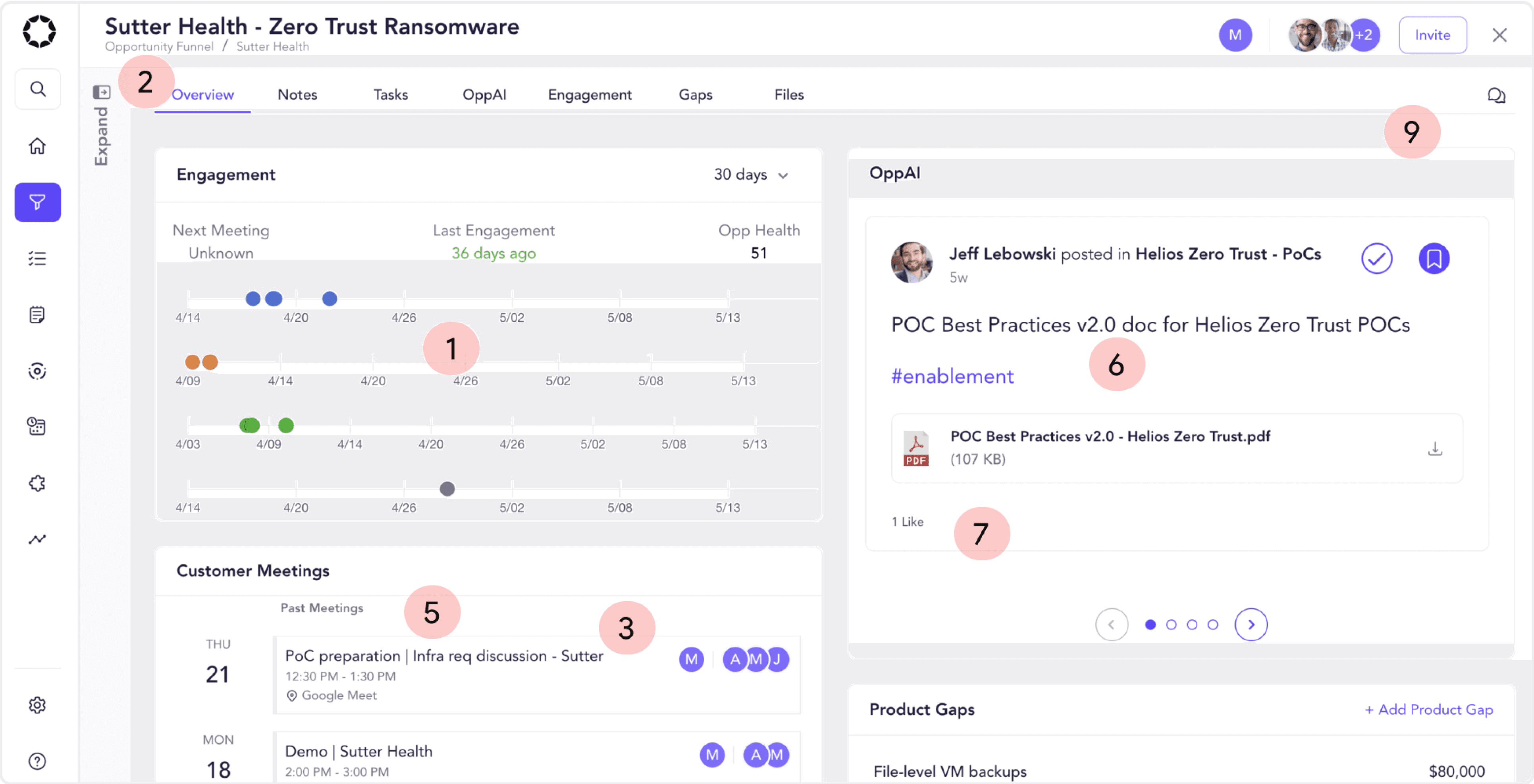
Difficulty in scanning data
Navigation challenges hinder seamless user movement
Lack of insightful information
Overwhelming user interface
Inconsistencies in design
Inappropriate font for the product
Non-compliance with WCAG standard
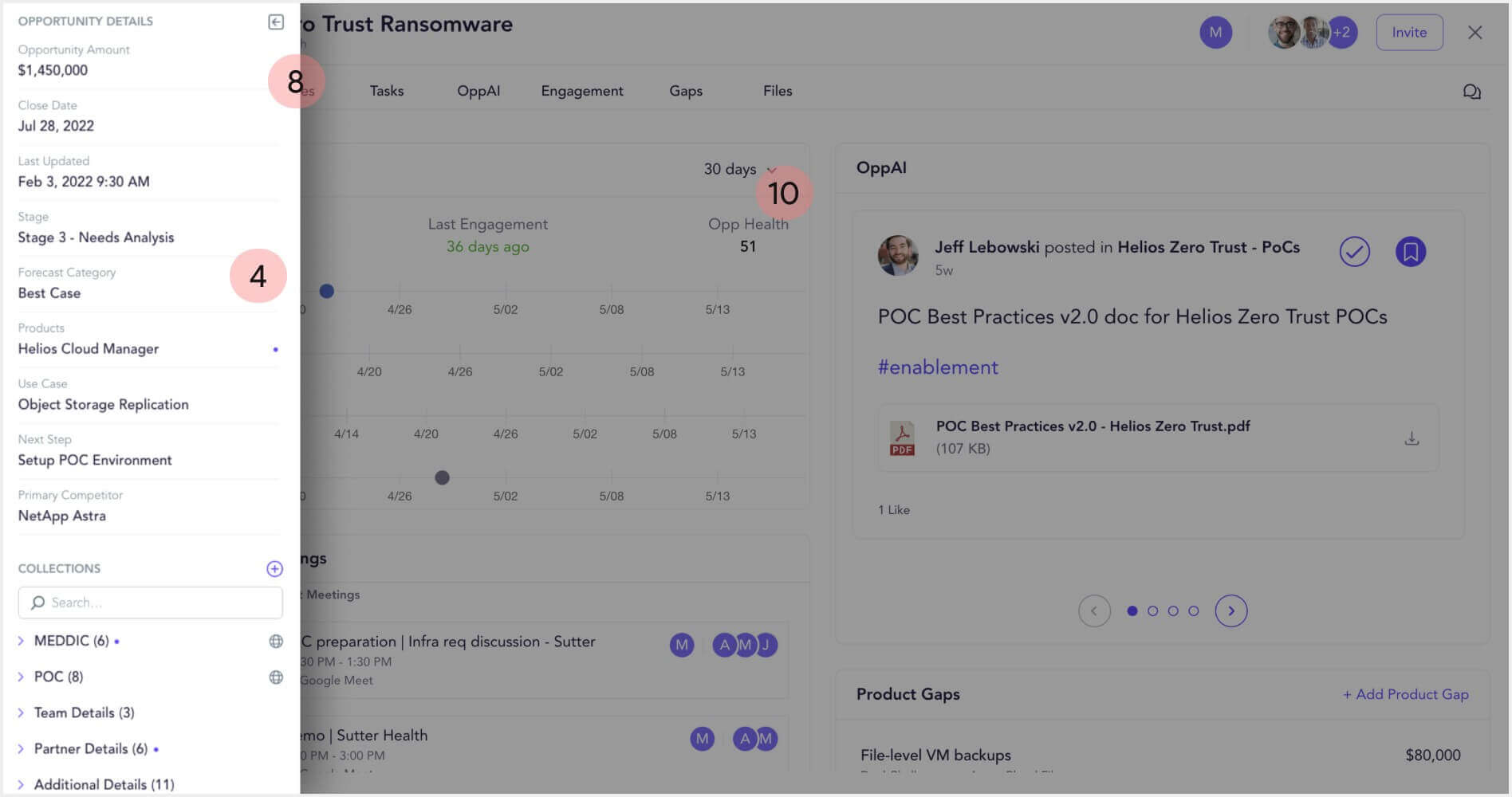
Opportunity collection expand/ collapse is unclear.
Lacks of fun, emotion and guided experience.
Doesn’t provide user control and freedom. Etc...
Competitive Analysis
In terms of sales collaboration spaces, many competitors fall short, impeding the attainment of a truly seamless experience
We ninja-stalked our rivals, dissected their products like unicorn surgeons, and struck gold with insights! Now, our design moves are more calculated than a squirrel planning nut heists. We dove into key aspects of our competitor to understand:
The collaborative experience they offer
The structural organization of key data elements
The navigational experience within their platforms
Any innovative features that contribute to effective sales management. Etc...
This comprehensive examination of competitors has been instrumental in shaping a thoughtful and informed approach to our own product design, ensuring that we not only meet but exceed industry standards and user expectations. 🕵️♂️💎✨
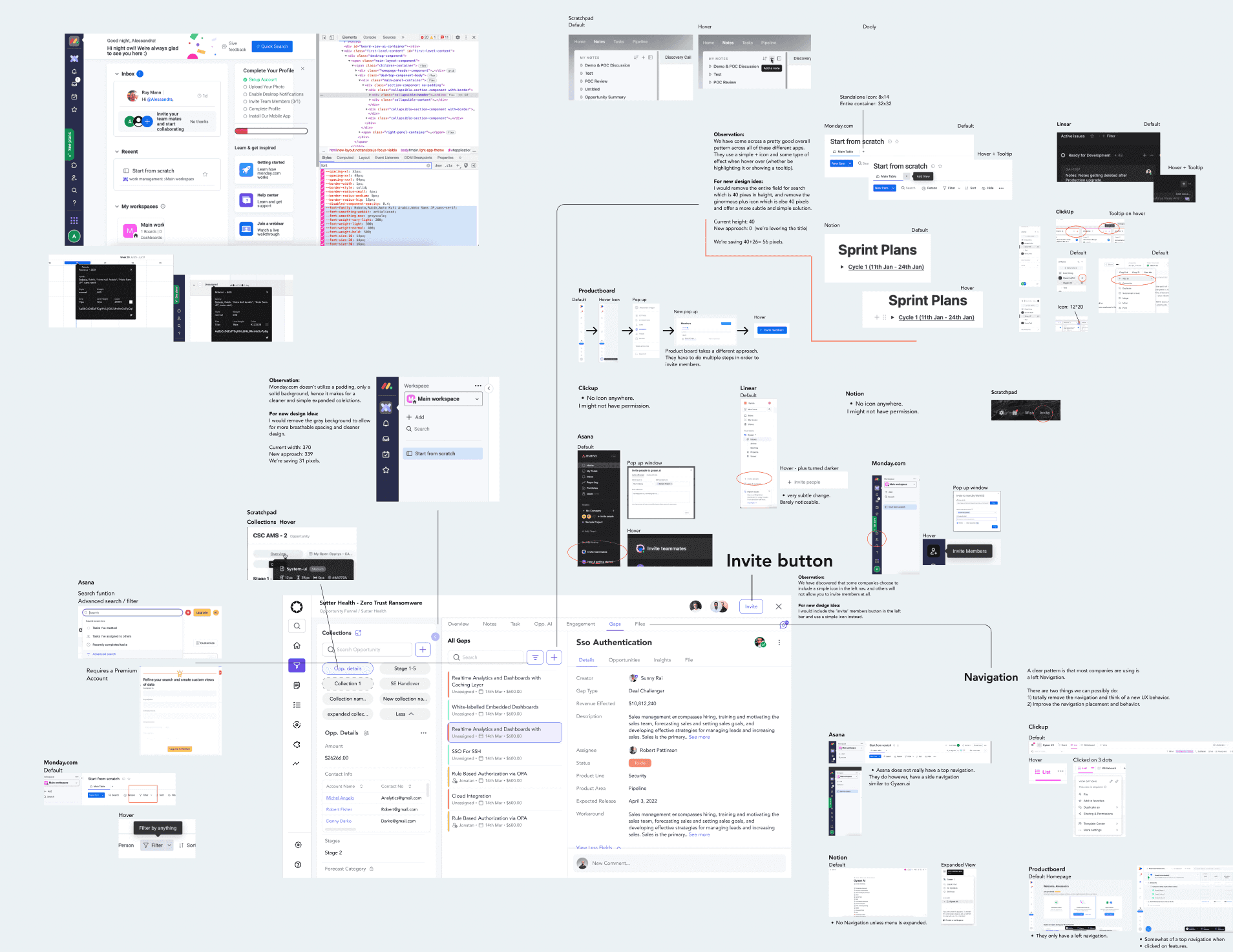
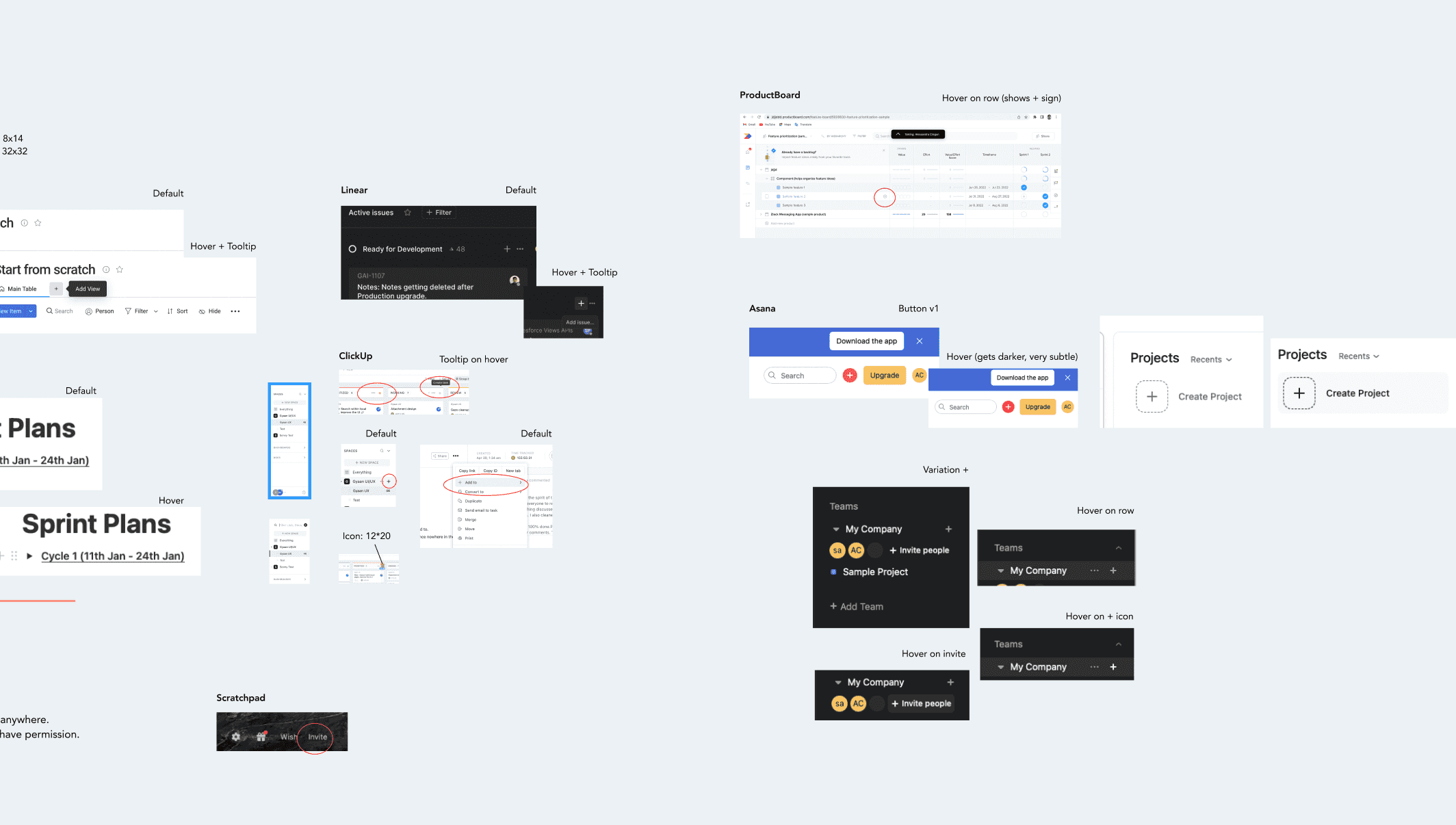


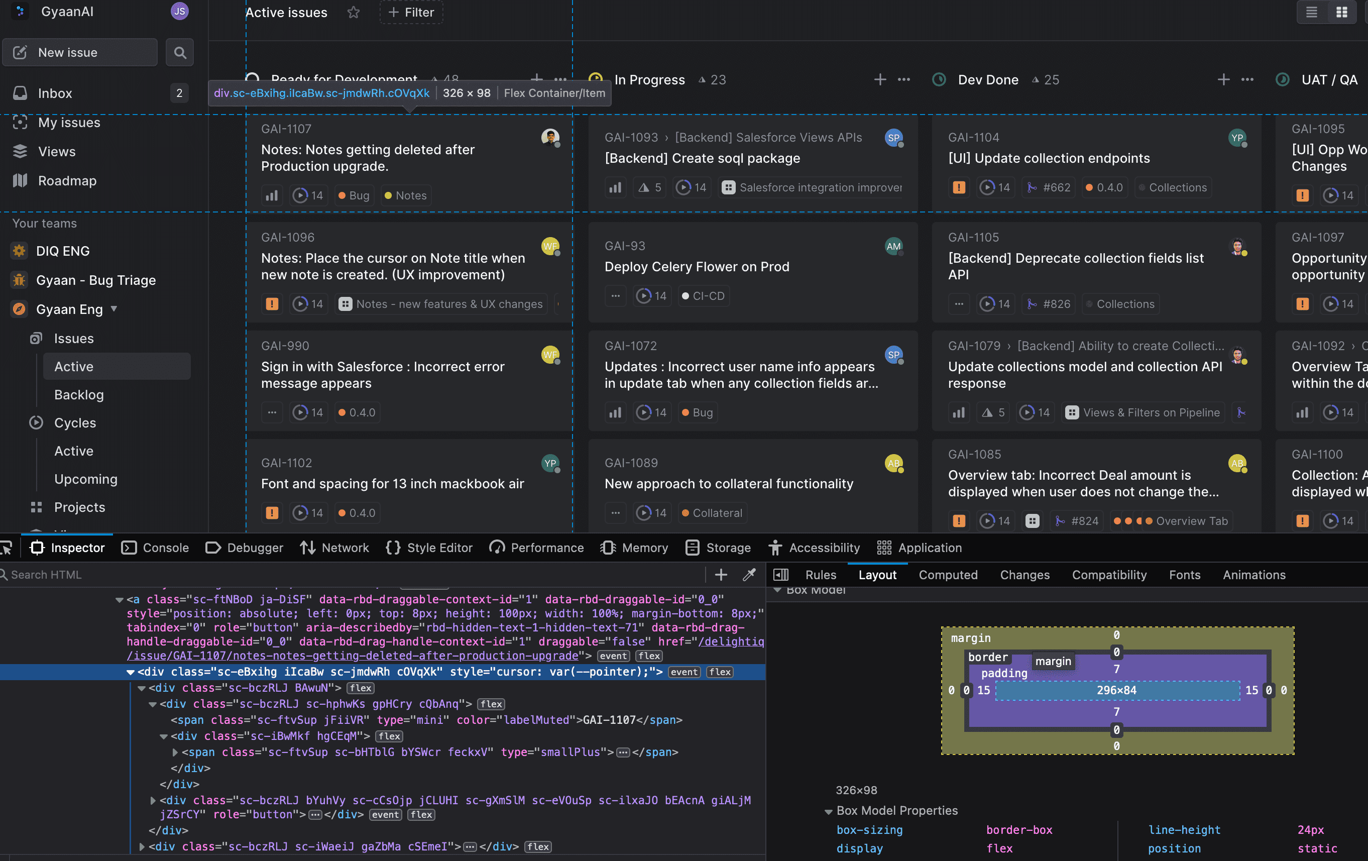
Brainstorming Competitors' Products Using Figma
Qualitative Research
Involving key stakeholders from the very beginning can make a huge positive impact in design decision...
After researching the competitors, we dove into the minds of Sales Managers, Engineers, and Executives – picture it as a superhero coffee date. We decoded user needs, danced with business requirements, and crafted a design symphony.
It's like Sherlock meets Tony Stark in a glorious mashup. Our secret sauce? A strategic approach that rocks business goals and high-fives user needs! 🕵️♂️💻🎉
Stakeholder Interview
What is the Sales Collaboration Workspace?
Who are our primary, secondary, and tertiary users for the Sales Collaboration Workspace?
How do we aim to distinguish ourselves in terms of sales collaboration?
Why do you believe a redesign of our sales collaboration workspace is necessary?
What aspects of the current design do you consider problematic or in need of improvement?
Can you share insights into the feedback received from our demo users?
Whom do you identify as our primary and secondary competitors in this space?
We are contemplating significant layout changes to align with WCAG, design guidelines, and ensure consistency. Would you be interested in exploring this with us?
If you could use a magic wand to influence our new design, what features or improvements would you wish for? Etc...
User Interviews
What is your role in sales within the company?
Can you describe a typical day in your professional life as a [Job Title] (e.g., engineer, manager, AE, etc.)?
How do you collaborate with individuals in various roles such as sales engineers, sales managers, and product managers?
What tools do you use on a day-to-day basis in your sales role as a [Job Title] (e.g., engineer, manager, AE, etc.)?
Do you have a preference for communication tools, such as Slack, or internal tools integrated within the sales product?
What types of data are crucial for you to have a quick overview of every day?
In your current organization, how do you go about assigning tasks, taking notes, and sharing files?
How important is it for you to access opportunity collections data while taking notes or assigning tasks?
If you had a magic wand to influence our new design, what features or improvements would you wish for, and why? Etc.
Spicy Questions for Stakeholder and User Interviews (Bonus: We spiced things up with follow-ups and some juicy insights during the call! 🌶️)
User Persona
Current experience feels unclear, overwhelming and lacks of important datas
After analyzing all the research insights, we ventured into the wild jungles of the 'Sales Collaboration Space' process. We embarked on an adventure where interviews, surveys, and usability tests served as our trusty tools, akin to a sales industry version of James Bond gadgets.
During our interviews, we unleashed a barrage of questions about sales collaboration experiences, expectations, and goals. It was like a talk show, but instead of celebrities, we were grilling users about their preferred methods for collaborating with customers, peers, and all the personas in their work universe. 🌐🎙️
Michel foucault
Age: 35
Sales Manager
Pain Point
As someone who regularly juggles various sales tools, I struggle to maintain clear data visibility. The challenge lies in monitoring my team's activities for specific deals, and the diverse array of tools hampers seamless coordination, potentially causing inefficiencies in our overall sales process.
Emily brunt
Age: 23
Sales Executive
Pain Points
I find it challenging to keep track of meeting notes, and sometimes it becomes a struggle to locate notes related to specific opportunities. It's even more difficult when using different products to assign tasks, take notes, and view pipelines, which noticeably slows down my sales process.
Jimmy Fallon
Age: 42
Sales Engineer
Pain Points
Most sales management tools out there seem to lack effective communication. Personally, I would love a tool that bridges the gap between management, communication, and collaboration. Such a solution would significantly accelerate our team's progress.
Sketch
Drawing rough sketches to find quick solutions is an enjoyable, efficient, and time-saving approach
With all the insights in mind, we dove into sketching rough ideas—because who said unraveling design solutions can't be a little playful? It not only saves time, minimizes irritation, and makes idea presentation a breeze but also turns the design journey into a fun, creative adventure.
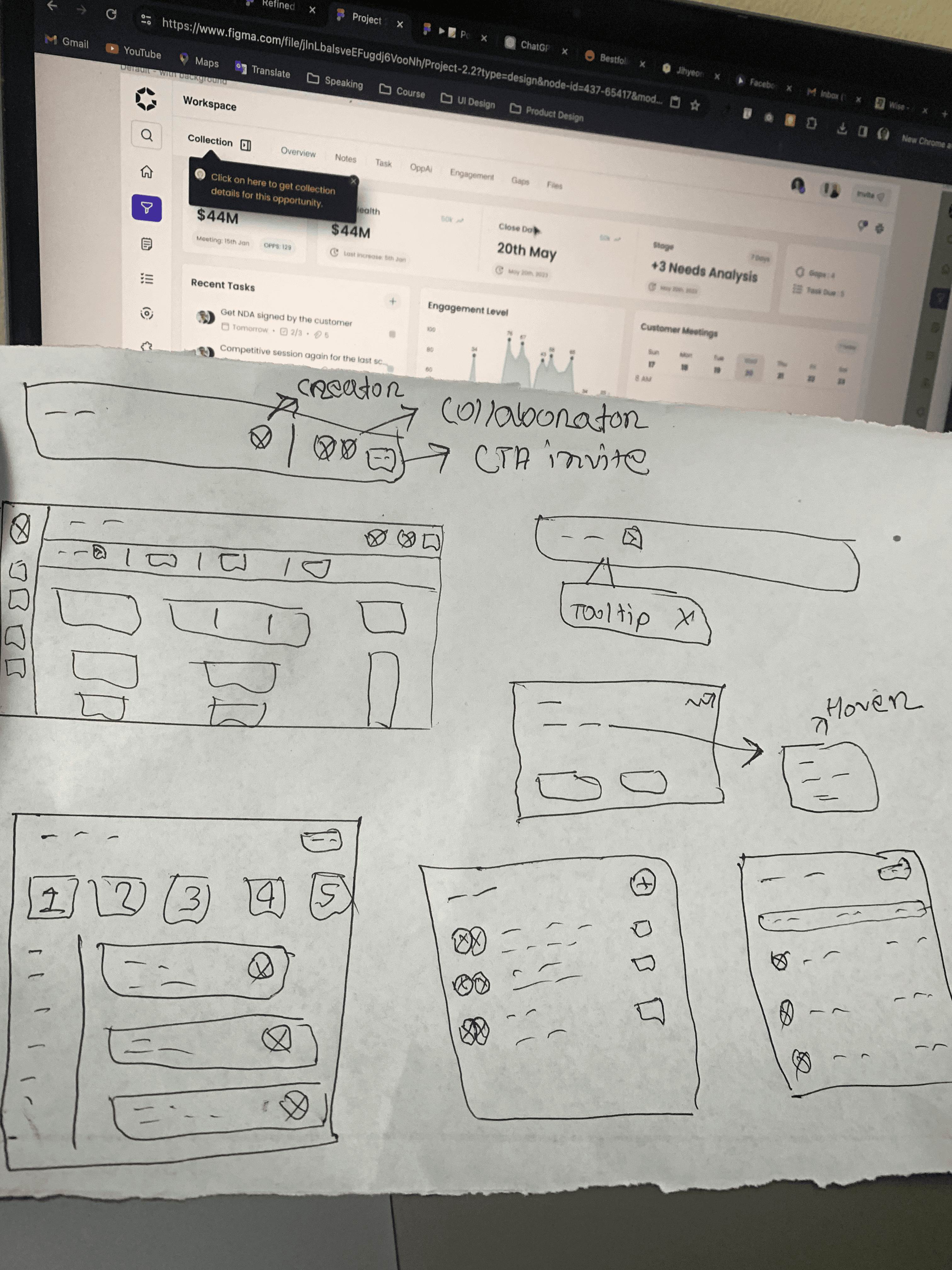
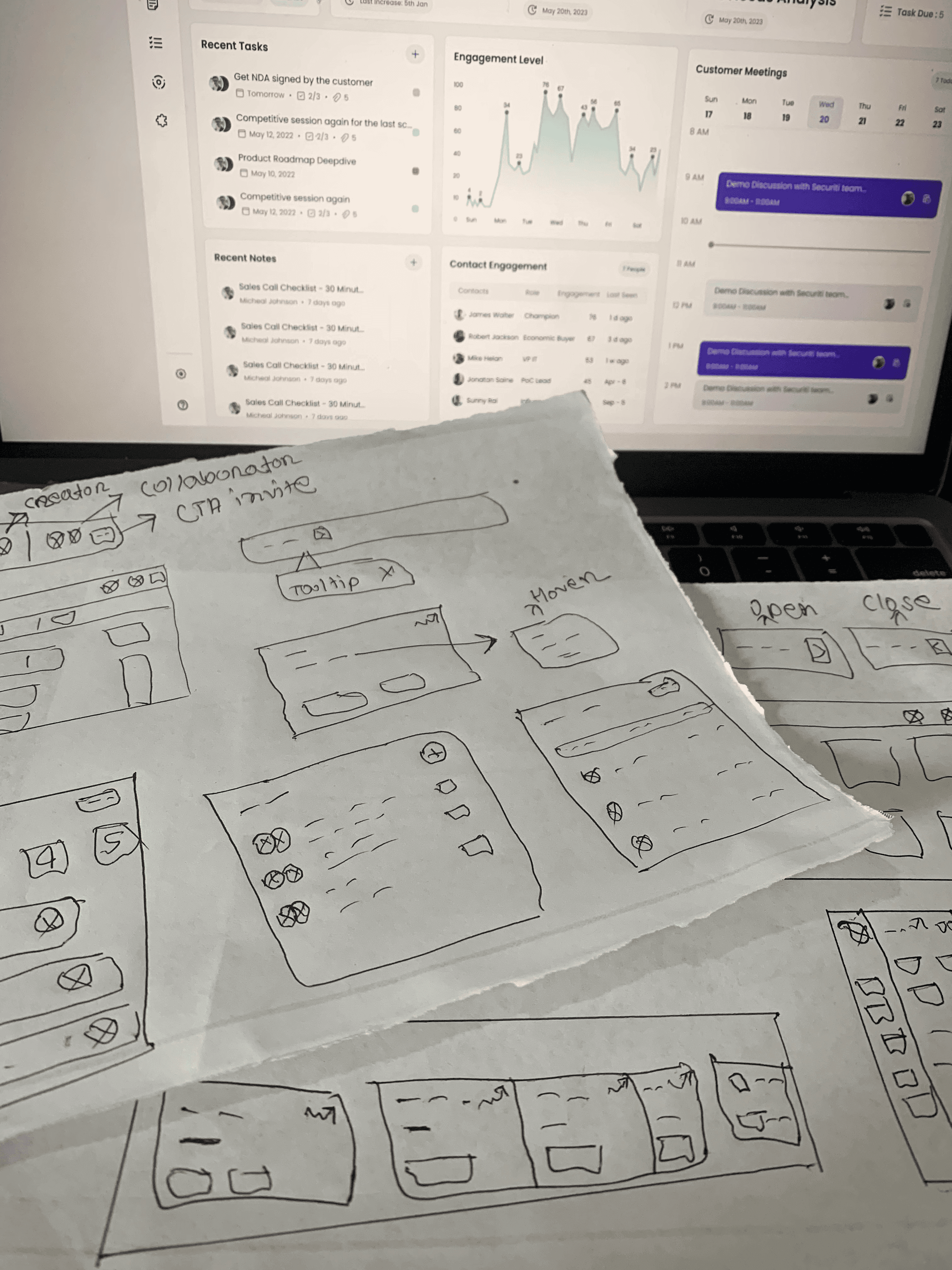
Behold, the masterpiece in progress: Rough Sketches! (Don't mind my cryptic handwriting - it's the secret sauce! 😄)
Finally, we conducted usability tests to gather feedback on the new design of the sales collaboration workspace features. We observed users as they interacted with the product and asked them to provide feedback on their experience, allowing us to refine and enhance the user interface based on the insights we’ve gathered.
Final Solution
Designing a seamless, user-friendly, and insightful collaboration workspace.
After facing a few bumps and gathering user feedback, we happily presented the final design to our developers. I handed over the design package complete with notes, annotations, and a sprinkle of design system insights. As the Design Quality Assurance superhero, I made sure our creation was implemented flawlessly. It's not just work; it's a design adventure!
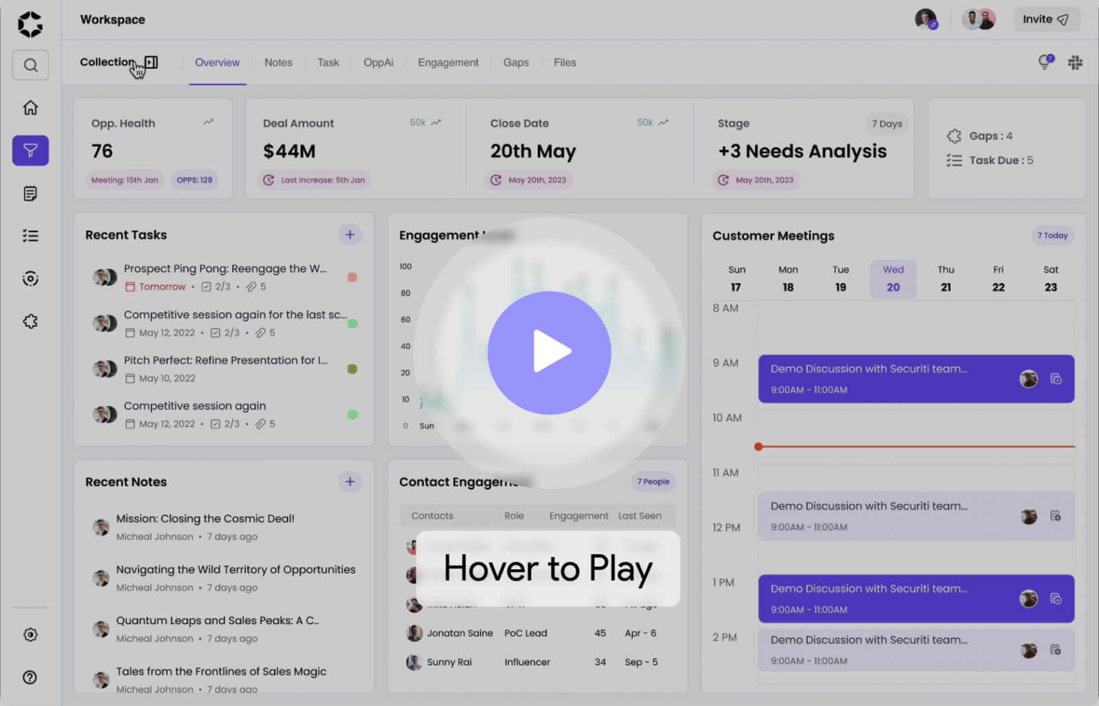
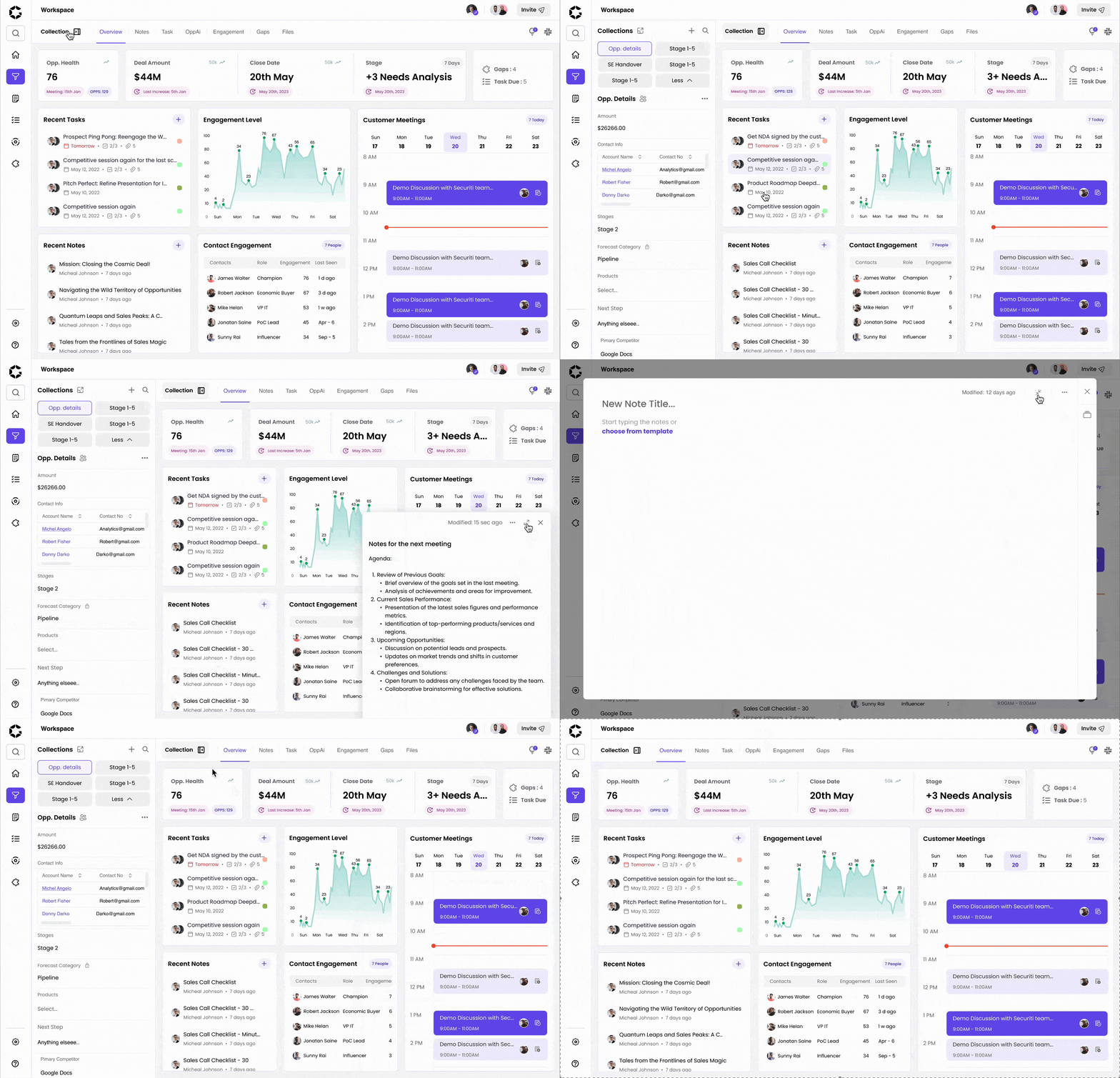
Here is a quick glance of the old vs new design improvement. 👇

Having User control & freedom
Previously, clicking a note/task/meeting redirected users to separate flows, hindering quick reviews from the workspace overview. We solved this by adding a popup design for easy access and freedom while viewing.
In the previous design, opening the left panel prevented users from selecting anything beneath it (tasks, meetings, etc.). Now, users can seamlessly access the left panel, match data, and view other elements with ease.
Easier Navigation, Clarifying Experience
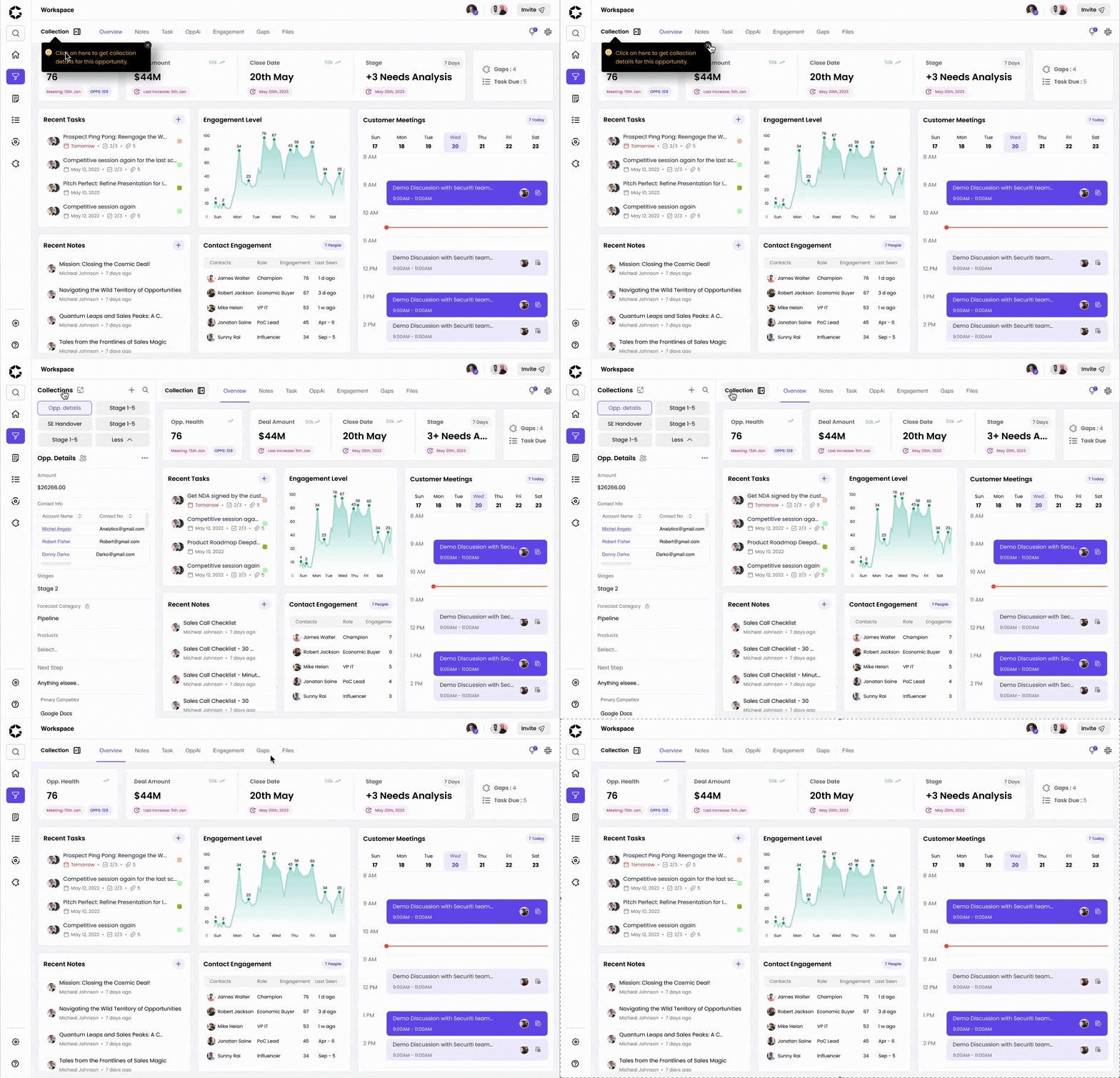
Previously, opening the left collection panel presented a difficult, unclear, and unacceptable experience for users. We have enhanced the navigation for opportunity collection, making it prominent, user-friendly, and easily accessible.
Added a tooltip for demo/ new users, highlighting changes to the collection opening experience as a crucial update.
Established the design system and improved the design hierarchy to clarify the user experience.


1
2
3
Making the workspace insightful & collaborative
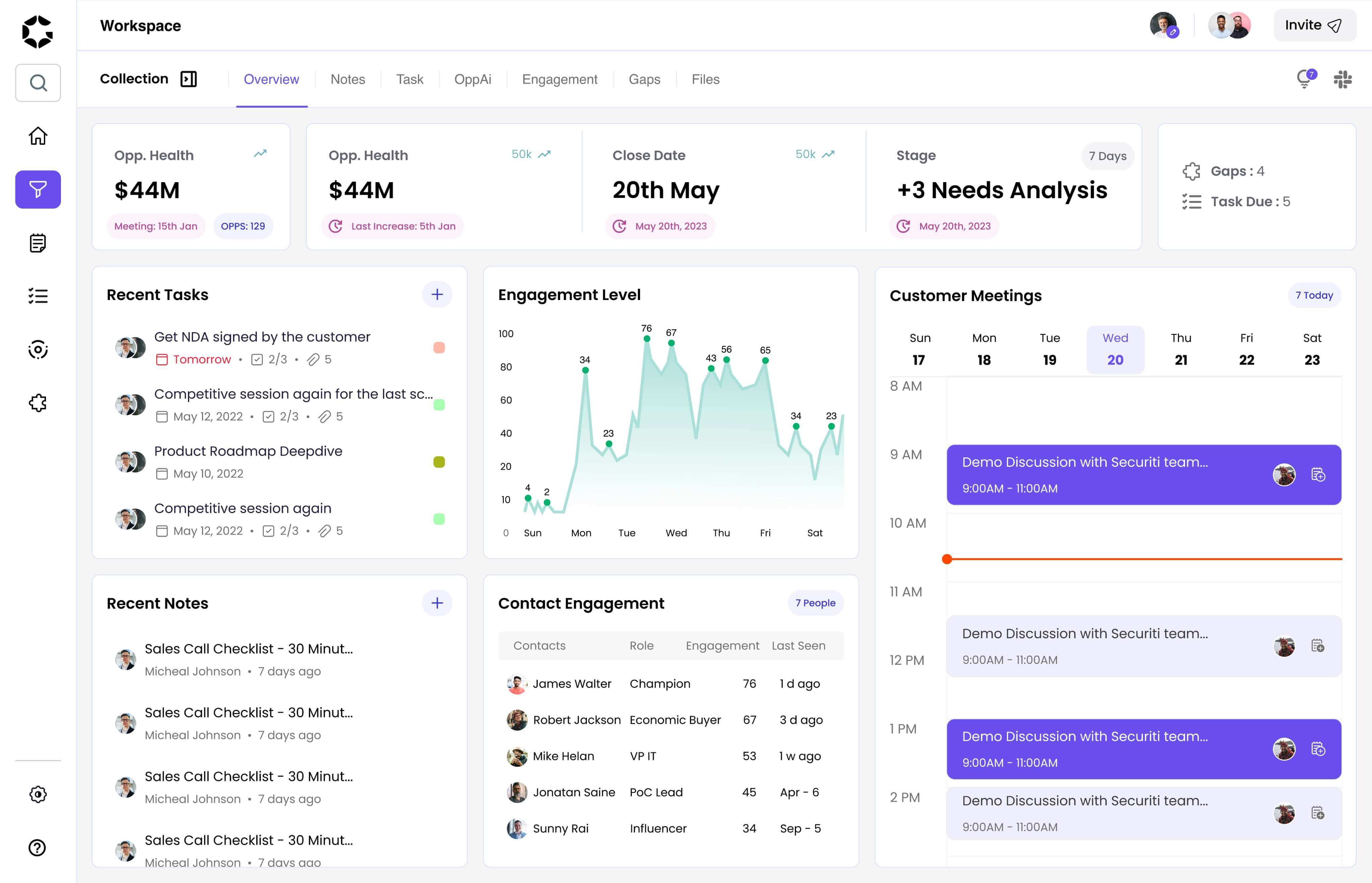
Added a top overview section with insightful data (Opp. health, close date etc) to facilitate faster, easier, and smoother sales deal progression.
Removed unnecessary cards (Opp. Ai, Gaps, Engagement bubbles) and incorporated more insightful information based on user feedback and stakeholder meeting insights.
Enhanced the customer meeting section's prominence on the overview page, dedicating additional space and introducing improved features such as date selection, scroll functionality, and enhanced contextual information for a more flexible and user-friendly viewing experience.
Also, based on users and stakeholders' feedback, we've...
Enhanced design readability by maintaining hierarchy, adhering to consistent design patterns, and utilizing distinct font weights.
Optimized legibility by switching from Avenir to Poppins font, ensuring an easy-to-read and playful style compliant with WCAG standards.
Ensured design compliance with WCAG guidelines for improved accessibility.
Enhanced user-friendliness of the top navigation.
Elevated the visibility of the Slack integration icon through refined style, strategic placement, and improved design.
1
2
3
4
5

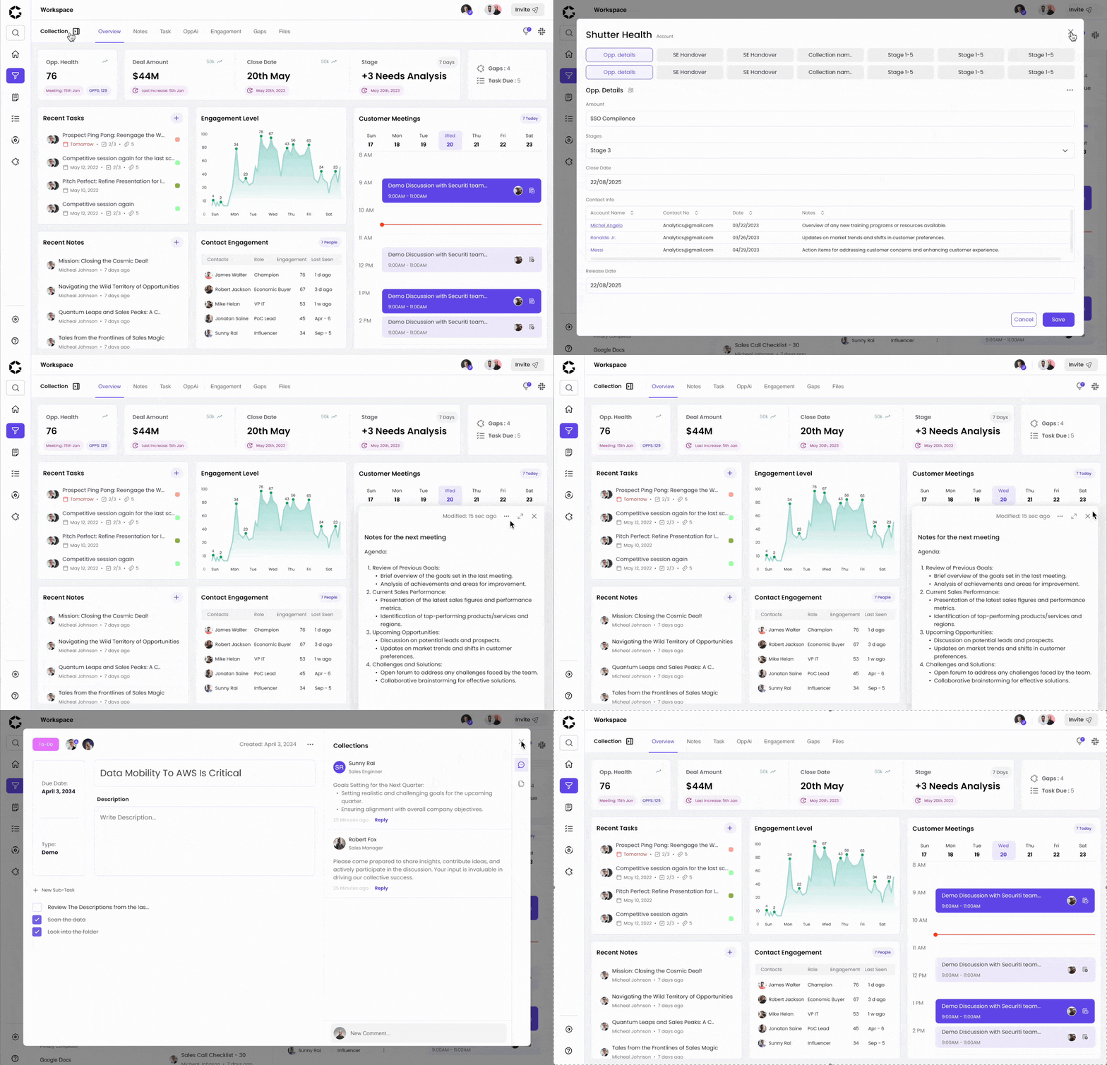
Sneak peek at the snazzy prototype of our ultimate design solution! 🚀
Outcome
“Hiring the UX team was a big success for the company!”
Sunny Rai (CEO)
As previously Gyaan was development-first company, they dipped its toes into the UX design waters for the first time with this project. And guess what? It turned out to be a blockbuster! Here are some highlights:
✅ Nailed all the requirements for the early demo, winning over sign-ups.
✅ Launched our shiny new MVP into the world.
✅ Attracted a whopping 100+ paying subscribers in just 3 months.
✅ Rolled in a cool 50K+ in revenue. 📈
✅ In this project, we developed the inaugural design system, resulting in a 40% boost in design and development efficiency.
Who said coding couldn't dance with design? This project just proved them wrong!
Learnings & Next Steps
Assumptions are great, but it's always worth testing them with real users...
Refining Feedback Processes:
Fighting off scope creep villains, our UX Team busted out some superhero moves! We crafted a feedback fortress using UX magic tricks like Impact/Effort graphs and How Might We (HMWs). The result? We sliced through project scope chaos, saving a whopping 60% of time for epic feature designs. It's like turning scope creep into a sidekick instead of the main villain! 💪🚀✨
It’s okay to take a step back:
From the surveys, 98% of the users' preferred device was desktop, but 2% inquired about mobile responsiveness. We, as a team, and stakeholders gathered to evaluate the impact and effort of incorporating a mobile-responsive design. After careful consideration, we decided not to move forward with it.
Seamless Collaboration Across Teams:
Navigating the intricate web of collaboration, I adeptly coordinated with Developers and Project Managers, ensuring a harmonious integration of design feasibility and diverse stakeholder needs.
Harmonizing Business and User Demands:
The project's evolution demanded a delicate balance between business imperatives and user experience. I embarked on a journey of brainstorming innovative solutions that seamlessly merged the two, prioritizing both efficiency and user satisfaction.
Strategic Design Advocacy:
Mastering the art of persuasion, I honed my skills in presenting designs and decisions to higher-ups and stakeholders. Articulating both best and worst-case scenarios, my pitches seamlessly integrated business considerations, ensuring alignment and informed decision-making.
For the next Steps:
We’ll continue to make improvements on data visualisation.
Work on the other tabs (notes, gaps etc).
Do more user testing with different user personas.
Make the experience more insightful, fun, and collaborative.
